
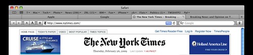
Safari 4 brought tabs-on-top to a mainstream browser, borrowing the appearance, if not the underlying architecture, of Google’s Chrome browser.
Placing the tabs above the address bar makes sense, because the address is subordinate to and dependent on which tab happens to be frontmost. However, the bookmarks bar is definitely not content specific to any tab; therefore, it belongs above the tabs.
There are other problems too. Because there is no title bar that represents the whole Safari window, it’s hard to move the window easily; one must be careful not to click on a tab’s close box or move widget. The reverse is also true: it’s difficult to click a tab without accidentally moving the window. If the mouse is moved even a tiny distance while the button is depressed, Safari assumes one is trying to move the whole window.
The above mock-up shows what Safari might look like if the window title bar and bookmarks bar were placed above the tabs.
One could argue that the toolbar buttons and the search box don’t belong below the tabs because, like the bookmarks bar, these controls do not represent content that is specific to any single tab. However, the address field needn’t take up the entire width of the window, so the spaces to the right and left of this field seem like a good place for these controls from a purely aesthetic perspective. Plus, moving them elsewhere would mean taking up even more screen real estate, and taking away from the simplicity and balance of the design.
I am glad to see Apple experimenting with new user interface paradigms, at least in beta versions of its software. Let’s hope the experts at the company figure out a way to solve the problems new design without sacrificing its elegance.
No comments:
Post a Comment