Today I was working on a couple of remote systems from my Mac. First, I was working on an Xserve, to which I had connected via Screen Sharing (Apple’s built-in VNC client in Mac OS X). Secondly, I was working on a Linux virtual machine via the vSphere client running on a Windows 2003 server. I had connected to this Windows box via MS Remote Desktop. I had to reboot the Xserve to install updates, and while I was waiting for the VNC connection to be reestablished, I switched over to the RDC session and started working on the Linux VM.
I opened a terminal window and started working—downloading code, compiling it, etc. I was halfway through typing a command when all of a sudden it seemed as though the space bar had become stuck. I don’t write this because the space bar was physically stuck; it just seemed that way because in the Linux console, the command line was filling with spaces. I quickly typed Control-C, but nothing happened. The spaces continued to appear, many tens per second, until the first half of the command I had typed had scrolled off the top of the terminal window. What was going on?
It was then that I realized that the VNC session had been re-established to the rebooted Xserve, and that Screen Sharing had stolen focus, forcing itself to the foreground, albeit on another display. Screen Sharing must have stolen focus between the time when I pressed the space bar down and the time when I released it. The remote box I’d been working on just assumed I was still holding down the space bar. This time, no damage was caused by this bug; however, it’s easy to imagine scenarios where this sort of problem could wreak real havoc.
Focus stealing is evil. Fix it, Apple!

Showing posts with label apple. Show all posts
Showing posts with label apple. Show all posts
2011-03-29


2011-03-04
It’s not just about technology
On Daring Fireball yesterday, John Gruber observed that the way Apple demos the iPad—sitting in a comfy chair, rather than standing at a podium—illustrates how Apple’s competitors overlook the non-technical aspects that go into making a product like the iPad great:
The Smart Cover is another good example. This clever invention combines a screen protector and a stand in one handy device that’s actually fun to use. It didn’t require huge amounts of technological investment, economies of scale, or multi-billion dollar purchasing power. It required only thinking about the problem in a novel way. Apple’s competitors could have come up with something like this, but they didn’t. If Samsung, HP, Motorola, and RIM cannot even compete with Apple on something like this, how can they hope to entice customers away from the iPad?
But there are other things any competitor could copy, easily, but seemingly don’t even understand that they should, because such things aren’t technical. Take that chair. The on-stage demos of the iPad aren’t conducted at a table or a lectern. They’re conducted sitting in an armchair. That conveys something about the feel of the iPad before its screen is even turned on. Comfortable, emotional, simple, elegant. How it feels is the entirety of the iPad’s appeal.
The Smart Cover is another good example. This clever invention combines a screen protector and a stand in one handy device that’s actually fun to use. It didn’t require huge amounts of technological investment, economies of scale, or multi-billion dollar purchasing power. It required only thinking about the problem in a novel way. Apple’s competitors could have come up with something like this, but they didn’t. If Samsung, HP, Motorola, and RIM cannot even compete with Apple on something like this, how can they hope to entice customers away from the iPad?
2011-02-24
Apple and Intel announce Thunderbolt
 The updated MacBook Pros announced today include a fast new IO system, developed jointly by Apple and Intel and formerly known as Light Peak.
Both Apple and Intel have agreed to call the new technology by a common name: Thunderbolt. When the IEEE 1394 interface (“FireWire”) was developed, different companies used different names to refer to the interface. This led to some confusion in the marketplace, and it seems Apple and Intel are hoping to prevent a repeat of this.

New MacBook Pro specifications appear on apple.com
Apple announced updated MacBook Pros today. The technical specs of the updated computers were leaked and widely publicized yesterday, and are now officially available on the MBP specs page.
2010-09-06
The evolution of iTunes from app to store
Some failed to grasp the sarcasm in my previous post. This is inevitable when one engages in satire. The ongoing discussion on iTunes 10’s bland UI led one commentator to write:
From Apple’s point of view, the iTunes/iOS ecosystem has reached a level of market penetration where the focus has shifted away from improving the app and moved more toward exploiting the app’s ubiquity to sell more content.
Since the introduction of the iTunes Music Store, Apple has made each release of iTunes more focused on directing users to stuff they can buy. Here’s just one example: If you click the little gray arrow to the right of an album name, you might expect iTunes to take you to that album in your own music library; but instead, it redirects you to the album in the iTunes Music Store.
Here’s another example: the Ringtones button reappears periodically in bottom row of icons in the iOS iTunes app, and the Podcasts icon disappears. The user can change this, replacing the Ringtones icon with the Podcasts icon; but after a while, it will change back again. Again, this has the effect of directing you toward stuff you can buy (ringtones) instead of stuff that’s free (podcasts).
And one last example: it is not possible to have iTunes save your password for free downloads only. If you want iTunes to save your password, simplifying the downloading of free apps, music tracks, and podcasts, then you must also have a valid credit card on file, and allow iTunes to save your password for purchases too.
Apple’s engineers are well aware that bland, colorless portions of the UI are less likely to capture and hold the interest and attention of the user. This is by design.
From recent updates to the iTunes app, we can infer the following design objectives:
1. Reduce the user interface to its spartan, utilitarian minimum, and focus the user’s attention on the content area of the window;
2. Lead the user quickly to purchasable or promotional content in the Store, and do this from as many places in the app as possible; and
3. Make it as easy as possible to purchase content.
I think the real motivation behind this is to [...] make what you can buy colourful and what you already own bland.He hit the nail on the head.
From Apple’s point of view, the iTunes/iOS ecosystem has reached a level of market penetration where the focus has shifted away from improving the app and moved more toward exploiting the app’s ubiquity to sell more content.
Since the introduction of the iTunes Music Store, Apple has made each release of iTunes more focused on directing users to stuff they can buy. Here’s just one example: If you click the little gray arrow to the right of an album name, you might expect iTunes to take you to that album in your own music library; but instead, it redirects you to the album in the iTunes Music Store.
Here’s another example: the Ringtones button reappears periodically in bottom row of icons in the iOS iTunes app, and the Podcasts icon disappears. The user can change this, replacing the Ringtones icon with the Podcasts icon; but after a while, it will change back again. Again, this has the effect of directing you toward stuff you can buy (ringtones) instead of stuff that’s free (podcasts).
And one last example: it is not possible to have iTunes save your password for free downloads only. If you want iTunes to save your password, simplifying the downloading of free apps, music tracks, and podcasts, then you must also have a valid credit card on file, and allow iTunes to save your password for purchases too.
Apple’s engineers are well aware that bland, colorless portions of the UI are less likely to capture and hold the interest and attention of the user. This is by design.
From recent updates to the iTunes app, we can infer the following design objectives:
1. Reduce the user interface to its spartan, utilitarian minimum, and focus the user’s attention on the content area of the window;
2. Lead the user quickly to purchasable or promotional content in the Store, and do this from as many places in the app as possible; and
3. Make it as easy as possible to purchase content.
2010-09-02
Desaturate now!
 Since Apple released iTunes 10 yesterday, some people with far too much time on their hands have complained about Apple’s decision to remove color from the iTunes user interface. “Grayscale icons are harder to identify than color icons,” they whine, “low contrast icons and UI elements are more difficult to read!”
Humbug!
These complaints are groundless and hysterical. The geniuses at Apple knows what they’re doing. These are the user interface professionals, remember? You know—the same perfectionists who invented the fucking GUI? Apple doesn’t make mistakes when it comes to the user interface of one of the company’s most vital applications! Trust Apple, and update your personal preferences. Color UIs were just a passing fancy, anyway.
I have long wondered when Apple would jump on the desaturation bandwagon. IBM boldly removed color from its UIs years ago. A directive was handed down that all user interfaces were to be harmonized—all across IBM Software Group. Professional graphic artists were brought in to do the meticulous and painstaking work of replacing confusingly colorful UIs with broad swaths of beautiful grayness (and subtle hints of blue). I am glad to see that Apple has finally chosen to embrace IBM’s proven leadership in user interface design.
I have long wondered when Apple would jump on the desaturation bandwagon. IBM boldly removed color from its UIs years ago. A directive was handed down that all user interfaces were to be harmonized—all across IBM Software Group. Professional graphic artists were brought in to do the meticulous and painstaking work of replacing confusingly colorful UIs with broad swaths of beautiful grayness (and subtle hints of blue). I am glad to see that Apple has finally chosen to embrace IBM’s proven leadership in user interface design.
My only small quibble would be that the iTunes 10 user interface still has too much color. I suggest that Apple follow through with what it has started, and complete the job of removing color from the UI. The capacity display for connected iOS devices is one of the worst offenders.


It’s so gaudy and crass, like a cheap toy prize from a gumball machine. All those colors, screaming for attention! They are more likely to distract and confuse users than to help them. Moreover, even if colors do help the user, relying color cues in the user interface amounts to discrimination against those with color vision impairments.

I’m sure you’ll agree that my proposed improvement is much more professional looking, conveying all the necessary information through a subtle yet rich palette of shades of gray.
Keep up the good work, Apple!
Keep up the good work, Apple!
2010-05-31
Skype on mobile devices

Yesterday, version 2.0.0 of the Skype iPhone app was released. The new version adds the ability to make calls over the 3G mobile telephone network. Mac Rumors and TUAW pointed out that Skype plans to begin charging a monthly fee for this service sometime later this year. When Skype will begin to charge for the service is not clear: the pop-up message that appears in the app indicates August 2010; the Skype page at the App Store indicates the end of 2010.
What is clear is that at some point in the coming months, it will become necessary to pay a monthly fee to Skype if you want to use the iPhone version of Skype to make calls over the mobile phone network. Mind you, this fee does not cover calls to ordinary telephones or mobile phones; for that, you’ll have to pay additional fees. The monthly fee we’re talking about here is just for the privilege of using the Skype iPhone app to make calls—even Skype-to-Skype calls—over the 3G network.
Skype-to-Skype calls made from the iPhone app will continue to be free when made over WiFi networks. Presumably such calls will also be free when made from the Mac or Windows version of Skype.
Convenience fee
What’s really interesting is the way Skype is hoping to earn money here. Skype is not really talking about charging for using the 3G network per se; instead, Skype is talking about charging for that subset of calls made from the Skype iPhone App. Many laptop users get their internet connectivity via the mobile telephone network, using a 3G USB dongle, or a built-in 3G transceiver in their laptop. In many places it’s also possible to connect your iPhone to your Mac or PC, enable tethering, and share the iPhone’s internet connection with your computer. In this way it is possible to make free Skype-to-Skype calls over the 3G network from the Skype application running on your computer. Skype is not talking about charging these Mac & PC users for ordinary Skype-to-Skype calls. However, the exact same calls made from the iPhone will soon require payment of a monthly fee.
Skype seems to be betting that users will gladly pay a fee for the convenience of calling from the iPhone version of the program.
Who must pay for Skype-to-Skype calls?
| Application | Platform | Connection | Cost |
|---|---|---|---|
| Skype | Mac/Windows | LAN | Free |
| Skype | Mac/Windows | Wi-Fi | Free |
| Skype | Mac/Windows | 3G* | Free |
| Skype | Symbian | 3G | Free |
| Skype | Blackberry | 3G | Free |
| Skype | Android | 3G | Free |
| Fring | iPhone | 3G | Free |
| Nimbuzz | iPhone | 3G | Free |
| Skype | iPhone | Wi-Fi | Free |
| Skype | iPhone | 3G | Monthly fee |
* including calls made over a 3G connection provided by a tethered iPhone
This strategy is similar to Apple’s approach to QuickTime Pro upgrades: the user pays for convenience, not additional features.
An argument can be made that it shouldn’t matter what the underlying network is. Each user pays for his or her own network connection, and I think Skype is going to have a challenge on their hands explaining why users should have to pay when a call is made over one network, but not another. After all, Skype doesn’t pay more to handle calls originating from 3G networks. And as mobile networks become faster and more widespread, a growing percentage of users will be doing more of their work on these networks. Users accustomed to making free Skype-to-Skype calls may be reluctant to begin paying just because they have switched networks. Skype is clearly hoping to get users accustomed to paying for Skype-to-Skype calls, and believes that 3G calls in the Skype iPhone app represent a good point at which to begin that process.
Skype on modified iPhones
Some iPhone users have been making calls over the 3G network for more than a year. There exists software that tricks the iPhone into thinking it’s on a Wi-Fi network, even when it’s actually just connected via 3G. There are several programs that accomplish this feat. Some cost money; VoIPover3G is free.
Installing these programs requires jailbreaking the iPhone—essentially removing Apple’s iTunes/App Store lock-in and enabling the installation of applications not approved by Apple. Jailbreaking has often been a complicated affair requiring some technical skill and no small amount of patience. However, the task has recently become much simpler, thanks to the Spirit application. It is likely that the speed and simplicity of the Spirit jailbreak will result in many more users choosing to jailbreak their iPhones.
For the past year or so, Skype on the iPhone has been able to detect when it it running on jailbroken iPhone. The first time a user runs Skype on a modified iPhone, the program displays a warning message stating that Skype is supported only on unmodified iPhones. The program continues to function normally though, happily making Skype-to-Skype calls over the 3G network. Version 2.0.0 of the Skype iPhone app does not noticeably change this.
An unanswered question is whether this will change later in the year.
If Skype is able to detect when it is running on a jailbroken iPhone, is the program also able to detect the presence of MobileSubstrate hacks? These are the small programs that fool the iPhone into thinking a 3G network is actually a Wi-Fi network. When Skype begins charging for the convenience of making Skype-to-Skype calls over 3G from the iPhone app, how will the program work on iPhones with such hacks installed? I can envision several possibilities:
On jailbroken iPhones, or on iPhones with a MobileSubstrate hack installed,
- Skype continues to work as today, warning the user but functioning normally;
- Skype simply refuses to run; or
- Skype runs but detects the presence of the hack, and does not make calls without payment.
It’ll be interesting to watch how this develops.
2010-01-28
The Apple iPad is the first tablet computer I would actually use
 Yesterday, Apple announced its long-rumored tablet computer, the iPad.
This is not first tablet computer; there have been many devices that could fall into that category released over the years. But all of them, including the HP ‘slate PC’ hurriedly rushed to the stage by Microsoft’s Steve Ballmer at CES a few weeks ago, have suffered from the same limitations. These limitations are due in large part to the fact that these tablet computers have been based on PC operating systems. Mac and Windows apps are not designed to be used with a touch-screen; so instead of offering something new and better, tablet PCs have offered something worse—ungainly hybrids that didn’t work as well as the PCs upon which they were based.
Apple took a completely new approach to the tablet computer, and has made obsolete all that came before.
Unlike earlier tablet computers, the iPad does not run a PC OS like Windows or Mac OS X. Instead, the iPad runs a new version of the iPhone OS, an operating system built from the ground up with touch as the primary interface. There is no pointer or cursor; your fingers are the pointers. There are no command key shortcuts; instead, multi-touch gestures provide the vocabulary of human-computer interaction.
Apple is the only significant computer manufacturer that controls the whole widget: the battery, the CPU, the OS, and the core applications—Apple does it all. The results speak for themselves. Watch the iPad video or if you have a bit more time, the video from yesterday’s special event. Microsoft, Amazon, and others will have to work hard to match what Apple has accomplished with the iPad.
I’m convinced that the iPad will shortly become the first popular tablet computer. It will define new standards for touch-based interfaces that will be aped by Microsoft and other imitators.
The iPad is not without problems. There’s no way to add more memory; the 3G version cannot be used as a phone; there is no camera; and the pixel density is anemic for a device meant to be used up close. But these are minor nitpicks. Some of these features were no doubt left out intentionally due to cost or time constraints. Apple doesn’t include a feature until it can be done well. It’s certain that future version of the iPad will address some of the more obvious gaps.
I’m excited about the iPad and look forward to playing with one at the Apple Store on Bahnhofstrasse in a few months. Will I buy one? That remains to be seen. Ultimately, my decision will be based on whether I determine that the device provides a compelling capability that I don't already get from my iPhone 3GS and MacBook Pro.
2009-02-26
Safari Tabs

Safari 4 brought tabs-on-top to a mainstream browser, borrowing the appearance, if not the underlying architecture, of Google’s Chrome browser.
Placing the tabs above the address bar makes sense, because the address is subordinate to and dependent on which tab happens to be frontmost. However, the bookmarks bar is definitely not content specific to any tab; therefore, it belongs above the tabs.
There are other problems too. Because there is no title bar that represents the whole Safari window, it’s hard to move the window easily; one must be careful not to click on a tab’s close box or move widget. The reverse is also true: it’s difficult to click a tab without accidentally moving the window. If the mouse is moved even a tiny distance while the button is depressed, Safari assumes one is trying to move the whole window.
The above mock-up shows what Safari might look like if the window title bar and bookmarks bar were placed above the tabs.
One could argue that the toolbar buttons and the search box don’t belong below the tabs because, like the bookmarks bar, these controls do not represent content that is specific to any single tab. However, the address field needn’t take up the entire width of the window, so the spaces to the right and left of this field seem like a good place for these controls from a purely aesthetic perspective. Plus, moving them elsewhere would mean taking up even more screen real estate, and taking away from the simplicity and balance of the design.
I am glad to see Apple experimenting with new user interface paradigms, at least in beta versions of its software. Let’s hope the experts at the company figure out a way to solve the problems new design without sacrificing its elegance.
2007-03-15
Razer Pro|Click v1.6 mouse
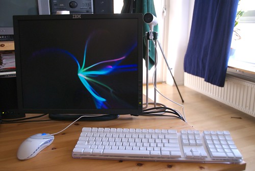
Ever since I bought my Mac Pro, I have been disappointed with the Apple “Mighty Mouse” that came with it. I like the innovative scroll ball, but aside from that the mouse is frustrating to use. Specifically, the Apple mouse isn't particularly usable if you want to right-click.
One can perform a right-click with the Mighty Mouse, but it ain't easy. There's only one switch in the mouse to register clicks, and one clicks the mouse by pressing the whole mouse down. The top of the mouse is one solid pice of plastic, so the left and right mouse buttons are not physically separate. The mouse determines left-clicks from right-clicks using a touch-sensitive surface on the top.
Because there's only one clicker switch, the mouse has a hard time knowing what to do when you have your fingers resting on both sides of the mouse (as I usually do). Apple's engineers decided that the best way to solve this problem was to interpret any click as a left-click if the user's fingers are touching the left side of the mouse. So in order to right-click, you must click on the right side of the mouse without having any fingers resting on the left side. If any part of your hand is touching the left side of the mouse when you click, the mouse will interpret any click as a left-click. It's very, very annoying. As you can probably guess, it's also impossible to perform a simultaneous left-and-right-click with this mouse.
Apple's design decision means that the mouse looks good, but doesn't work well.
It's yet another example of how Apple has sacrificed function in the name of form. Some of Mac OS X's eye-candy features, like the magnification of icons in the Dock, fall into this category as well.
I had tried to adapt my mouse-using behavior to match the constraints imposed by Apple's faulty design; but it was no use. I found myself having to click twice or even three times before the mouse would properly register a right-click.
I shouldn't have to change the way I work to adapt to the peculiarities of a tool. It should just work.
So yesterday I finally bought a replacement for the Apple mouse. After a bit of searching, I opted for the Razer Pro|Click v1.6 mouse. It's not wireless, the side buttons are a bit awkward to use, and the scroll wheel isn't as nice as the Mighty Mouse's scroll ball; but even considering these shortcomings, I'm very happy with the new mouse. After one day of using it, I'm already working much more efficiently than I ever could with the Apple mouse.
Update 2007-03-15 21:45 UCT — The drivers included with the mouse were compiled only for PowerPC. Razer's web site has updated drivers that work with Intel-based Macs.
Subscribe to:
Posts (Atom)