2011-12-13

Lucia 2011

_MAL4844
Lucia concert at Storkyrkan, December 2008
I shall never forget my first Lucia in Sweden. In Stockholm on my own for job interviews, I was startled by the darkness and cold. New friends took me to the Christmas market on Gamla Stan, where we warmed ourselves with glögg and roasted almonds. We then went to the Lucia concert at Storkyrkan. The beautiful music and candlelight reflecting off the red brick walls of the old church transported me to another place, far from the cold, dark city. It was magical and inspiring.

Twelve winters after that snowy Stockholm night, I found myself singing the same songs of the season, in the Predigerkirche in Zürich. Tonight was the dress rehearsal for Nota Bene’s annual Christmas Concert in two days.

I fell like I have come full circle. Come Wednesday night, I hope that my voice may, like Lucia, cast light into the darkness—and perhaps lift the spirit of a lonely traveler far from home.

Happy Lucia!

2011-12-05

Fade away

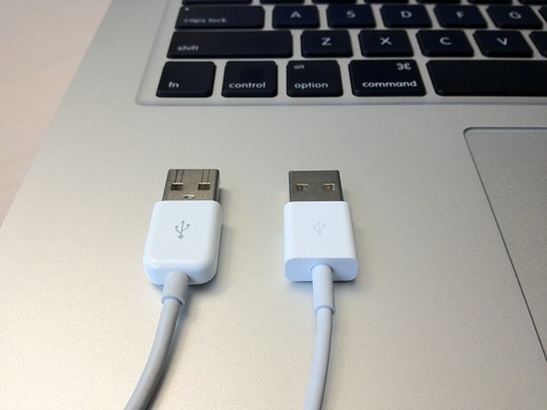
Since getting my new iPhone 4S, I have found it more difficult to tell which side is up when plugging in the cable. I thought at first it was just my eyesight, but a closer look revealed the truth.
USB connectors by Michael A. Lowry
USB connectors, a photo by Michael A. Lowry on Flickr.

The labels on the connectors of the new cable are smaller and printed in a lighter color than on the old cable.

This is not merely a cosmetic change. It’s a functional one.

Because the connectors on both ends of the cable are symmetrical in shape, it’s impossible to tell by touch alone which way is up. The USB logo and corresponding dock connector logo printed on the connectors are important visual cues that save people time when connecting devices. The new markings are very difficult to see. They are practically invisible in low light and to those with poor eyesight.

It’s surprising that a detail like this was overlooked. One hopes that Apple, a company renown for its attention to detail, will address this oversight promptly. A less charitable view is that this was a deliberate choice, motivated perhaps by the same thinking that led to the company’s recent fascination with desaturation in its user interfaces.

2011-12-03

A simple solution to misscrolling

Tim Bray discusses a problem he calls ‘misscrolling’—the disorientation one encounters when scrolling down through a document page by page, and reaching the bottom:
For some reason, browsers are reluctant to leave white space showing at the bottom of the window… leaving the last line you were reading stranded at some random location in the middle of the page.
When this happens, my flow of reading is disrupted because my eye doesn’t knowwhere to go to pick up where I left off.
I thought of this solution a couple of years ago: immediately after scrolling, if the end of the content has been reached, a red line should appear at the point that was the bottom of the page before scrolling. This red line should fade away after a few seconds. The red line tells you where you left off, so you know exactly where to continue reading.

I saw something like this in an e-book reader a few weeks ago. It wasn’t implemented as a line, but a little arrow marker that appeared briefly in the left margin.

Padding the bottom (or indeed, any side) of a document with white space doesn’t seems like the best solution to this problem. When one reaches the end, there should be a clear indication of this. Apple has chosen to bring iOS’s ‘rubber-banding’ effect the Mac to make these edges even more clear to the user.

In a text editor or spreadsheet program, it makes sense to let the user could scroll an arbitrary distance beyond the limits of the content; however, this wouldn’t make a web browser easier to use.

Via Daring Fireball.