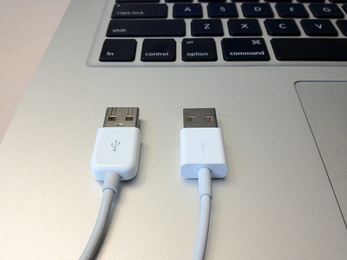
USB connectors, a photo by Michael A. Lowry on Flickr.
The labels on the connectors of the new cable are smaller and printed in a lighter color than on the old cable.
This is not merely a cosmetic change. It’s a functional one.
Because the connectors on both ends of the cable are symmetrical in shape, it’s impossible to tell by touch alone which way is up. The USB logo and corresponding dock connector logo printed on the connectors are important visual cues that save people time when connecting devices. The new markings are very difficult to see. They are practically invisible in low light and to those with poor eyesight.
It’s surprising that a detail like this was overlooked. One hopes that Apple, a company renown for its attention to detail, will address this oversight promptly. A less charitable view is that this was a deliberate choice, motivated perhaps by the same thinking that led to the company’s recent fascination with desaturation in its user interfaces.

No comments:
Post a Comment