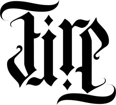
This is probably my favorite of the four, in part because it just looks good, and in part because it's simple and elegant. Note how the shape of the top crossbar of the F is replicated in the middle crossbar, establishing a link between these elements of the character and making the two strokes seem to be a part of the same character. And see how the round parts of the r and e essentially dissapear when these letters are inverted; when inverted, these curves seem like mere artistic flourishes and do not detract from the readability of the characters — very clever.

No comments:
Post a Comment